Product development
OMA SATO tenant’s app
Digitalizing housing services – all housing service in you pocket.
Omasato – Full digitalization of housing services MVP
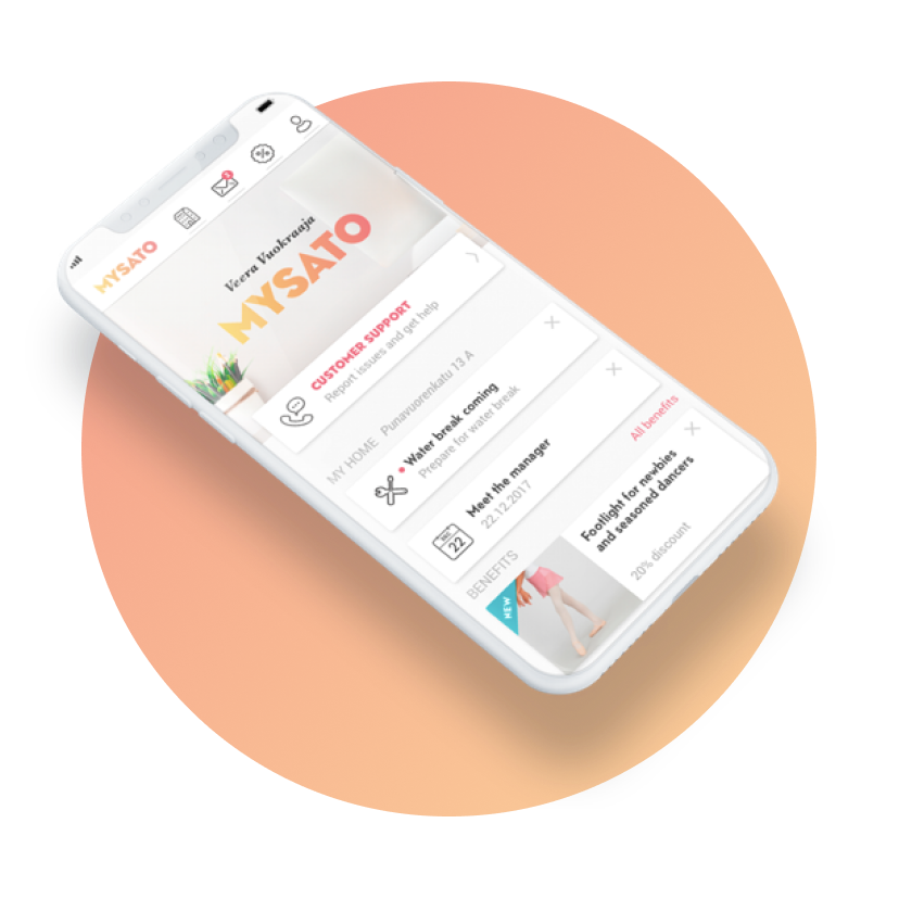
Sato OmaKoti is a digital service for all Sato’s tenants from where the customer can manage all issues related to housing digitally. The purpose for OmaKoti service was to digitalize most of Sato’s services for over 30 000 people, and to lessen the load for customer services. The work was carried out in Agile framework.

Project in short:
First digitalization of Satoäs services for tenants.
Goals:
The goal was to develop and design a digital service concept for Sato, to provide everything a tenant needs in digital, pocket-fitting way. OmaSato includes: Contacting maintenance, sending maintenance requests, place to find flat deatils, sauna booking, payments, messaging and customer benefits.
Team:
2 designer, 2 developers, architect, PO, QA
My role in the project
We in the team worked side-by-side, basically working in parallel activies during the whole 9 month project. Concept design, structure design, graphic design, UI/UX design, design systems.
Who’s the user?
Launching the project
The scope
The scope was to digitalize pretty much most of the services Sato provides to their customers. The goal was to ease the workload of the Sato call-center workers.
User insights
Our team asked to be seated next to the customer service workers, which turned out to be a very good decision. We interviewed customer center workers, but sitting side by side to them and meeting them in the common cafe area, brought us loads of valuable insights.
Architecture
We iterate the architecture option with our architect and discuss the best options how to lay out data and contents. This also gives sturcture for our schedules.
Reducing options
Activities: We discuss and iterate user flows, prioritize tasks, and schedule
Challenges: Very ambitious projects, lot’s of work to be done
Stages: Service structure ● Architecture ● Fixing content – what’s in the scope ● wireframes ● prorotypes ● user tests ● facilitation
Wireframe concepts
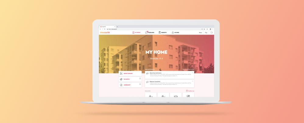
Competing wireframe concepts for structure, pages and user flows. Mobile first, browser included.
User needs
Graphical concepts
A war graphical concept was done 6 months prior our project. We fine tune the graphical conept more suitable for digital domains.
Prototyping
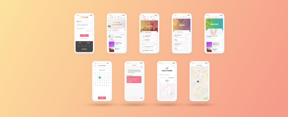
Prototypes from various user flows
User pool evenings
Sato organizes tenant evenings, and together with a facilitation experts, we facilitate user interviews (large, appr. 40 people in each evening), to test our graphical concepts and digital prototypes.


The big picture
Narrowing the funnel
Activities: The double diamond funnel narrows. The design concepts are further develop and more fine-tuned.
Challenges: Very late changes in principal elements in design system, affecting the work.
Stages: Design system building ● Co-op with DS team ● Breakpoints and layout deviations ● dev-co-works ● UX/UI&interaction design
Visual concepts
Visual concepts develop into more detailed concepts. We bring into the discussion movement and sound, and whole of user experience.
Delivarables
We work in Sketch. We finalize user flows and functionalities for our developer, and we have hand-over ceremonies in each sprint.
Design system building
Our team creates design system elements as we move on.
Afterthoughts:
Together with a peer designer we started the project from Sprint 0, defining the wanted features and functionalities and then sorting them into MVP and after MVP groups. We had a graphical concept as a baseline for visual design.
During the 6 month MVP stage we had altogether 3 user pool events, where we tested out our ideas first in wireframes, then in visual presentations and finally in prototypes. All in all, project included wireframing, creating functional visual and n on-visual prototypes, pixel perfect iOS and Android layouts ready for production. Also, we created a design library to full extend along our work.
